 |
| A volunteer working on the flower "carpet" |
 |
| 2010 Tapis De Fleurs De Bruxelles |
One enormous print, that attracts tourists worldwide. The 1971 Tapis De Fleurs De Bruxelles was such a success back then they decided to make it a tradition, and what a beautiful tradition it is.
 |
| There's no accessories that are required here,unless you count your derriere! |
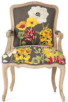
Print, print, print....There's no reason to fear it, some of it is gorgeous and some of it I would never consider. The key to working with print is not to go overkill with it. Have only a few key items in whatever room you're working on with print, especially a bold one like this twist on the traditional Louis chair that dons a good number of homes across the states.
This battersea sofette in Bloom from Anthropologie reminds me of the begonias in the Tapis de Fleurs de Buxelles. An array of colors, shapes and appropriate placement all make for a sofa that catches the eye.
You can customize your own lamp like I did with the one above from lamps plus. Pick a print, change the color or keep it the same. The red makes a statemtent. Period, the end.
If you take anything away from this post today remember not to "overprint" your home. Add a shade that's demure like this when using bold prints such as the Bloom couch above. Less is more with print, keep the print bold, keep the rest of the room simple and classic and you'll always have a design you love. Happy Sunday everyone!
~xo~Michelle~xo~


No comments:
Post a Comment