Sunday, September 26, 2010

Prints we love

Forget being passive and timid, it is time to be bold with prints and let them shout out your inner style. I'm beginning to think that they have the right idea in Belgium.  the flower "carpet" made up of begonias every two years has been a longstanding tradition since 1971.  Always using new designers the flower "carpet" spans a massive 80,000 square feet!

A volunteer working on the flower "carpet"


2010 Tapis De Fleurs De Bruxelles

One enormous print, that attracts tourists worldwide.  The 1971 Tapis De Fleurs De Bruxelles was such a success back then they decided to make it a tradition, and what a beautiful tradition it is.


There's no accessories that are required here,unless you count your derriere!

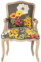
Print, print, print....There's no reason to fear it, some of it is gorgeous and some of it I would never consider.  The key to working with print is not to go overkill with it.  Have only a few key items in whatever room you're working on with print, especially a bold one like this twist on the traditional Louis chair that dons a good number of homes across the states. 


This battersea sofette in Bloom from Anthropologie reminds me of the begonias in the Tapis de Fleurs de Buxelles.  An array of colors, shapes and appropriate placement all make for a sofa that catches the eye.


You can customize your own lamp like I did with the one above from lamps plus.  Pick a print, change the color or keep it the same.  The red makes a statemtent.  Period, the end.


If you take anything away from this post today remember not to "overprint" your home.  Add a shade that's demure like this when using bold prints such as the Bloom couch above.  Less is more with print, keep the print bold, keep the rest of the room simple and classic and you'll always have a design you love.  Happy Sunday everyone!

~xo~Michelle~xo~

Monday, September 20, 2010

Summer, I bid you adieu

As much as I do not want to I have to, for you see fall has come upon us and it's not going to go away.  No more flip-flop wearing, sitting on the porch chilling, beach running, baseball watching fun in the sun.  Time to watch the sunset earlier as the coolness of fall slowly creeps in.  And so it is with much sorrow that summer, I bid you, adieu.


Do not get me wrong fall, there is nothing wrong with you, it's me.  It's all me, it's a problem with my feet you see.  They hate to be covered up except for the occasional sexy heel to wear out.  They like the warmth of the air and they like to breathe, they like the freedom of the sand in my toes.  I accept an over sized Victorian chair to sit and cross my legs in and have my soup and read Langston Hughes or the latest Dexter novel, I truly do.  I accept it, I welcome it.  How could I not when the chair looks like this?


Fall, tell me something only you would know.  Does this mean I have to say goodbye to walking the puppy?  Do I need to prepare to put on boots for the rain?  Look at him fall, how could you do this to him?  "How?" I ask of you, tell me.


What am I to do with all my empty Corona bottles?  Well not my bottles, if anything what am I to do with my wine bottles?

I told her not to make that face!


I guess here's a summer-sy solution that I can use inside of the house, or out on the porch.  I prefer the porch.  Alas fall, you are not mine enemy.  You provide me with great indoor seating that I love, indoor seating that I cherish.  If I could sit and cross my legs in a chair all day long I would, I really would. 

Since you like to shorten my summer, I guess I could take the time off and sit down in this Heron Lounge Chair by Charles Wilson or this Bo Concept Rocking arm chair.  Ironic isn't it?


Summer as I leave you and welcome fall with open arms, I embrace it and  will try my best to think of the fond memories that we have had this year.  I look forward to next year and creating new memories with my fall friend. 

~xo~Michelle~xo~

Wednesday, September 15, 2010

Wallpaper....what not to be afraid of

Your moms wallpaper, remember what it used to look like?  Did it look anything like this?  A dingy and dull pattern that once was in every home across America.  A pattern that could not escape any home or hippies dress as a matter of fact.
  Wallpaper has taken such a backseat to paint because it's a much more budget friendly option, requires less work and doesn't require matching up.  Well I say it's well worth it (as much as I love paint) I say not every room in your home has to be painted, switch it up, show more life than some paint, show wallpaper some love!

 Remember these ladies above?  Did you ever notice their wallpaper?  Well here it is.  Very Miami-ish, very leafy and big and bold and in your face.  Wallpaper doesn't have to be gaudy, just check out the updated version below. 
Subtle and textured, wallpaper that would appease the masses. 
Lets take a trip to the opposite end of the spectrum.  We have all heard the old adage for new brides walking down the aisle, you must have something old, something new, something borrowed and something blue. 
Brides, let them know it's in your home, and not on you.  This wallpaper by Umbra is a twisted version of that exact adage.  Something new: wallpaper, something old & borrowed: the scroll pattern, something blue: the color.  Your new marriage will have all the blessings in the world with this always at your side. 


Reminiscent of a Jackson Pollock painting (above to the left) is this gold & white wallpaper by Mable&Violet.

Not bold enough to plaster paper over your entire wall then try a wall decal a.k.a. "tattoo".
 
 A wall decal such as this one by Surface Collective is a good way to spruce up any room.  From an endless amount of options you have the possibility to change every room in your home to fit your mood, your style or just because you want a change.  Remember nothing is permanent in the world of design.  If you mess up switch it up, some of the greatest mistakes make for the greatest designs.  
 
~xo~Michelle~xo~

Friday, September 10, 2010

Budgeting Inspiration


Tight, tough, unforgiving and if I had a magic genie I would ask him to stretch it and make it endless.  Budget, budget, budget.  Excuse me?  Please look at me, take me with you, why am I not?  We've all been there, a room, a car, even a statuesque Adonis, but alas it was not meant to be. 
This Brooklyn home featured in House Beautiful is a budgeted inspiration for one of my faves Brande, a.k.a. B.  An eclectic mix of traditional with a slight modern twist makes this foyer a bold statement.  To a good 99.999999% of people it shouts $$$.  To me it shouts make me for less than $650, do it; you can't do it and to challenge you even more do it with California state tax included.  Well you know what I accept this challenge, but first we're going to need some elbow grease, patience (a whole lot) and love too!
Running Total:  Paint: $32.50
It took me 2 days to find this perfect punch of pink from Pantone, let me repeat myself 2 DAYS.  Only to find out the day of posting this the color on the foyer wall is Razzle Dazzle from Benjamin Moore.  Maybe it's because I worked with paint for seven years or maybe it's just my anal retentiveness but you know what, I DON'T CARE!  Pantone stays and it's perfect!
Spray Paint:$33.78 (Total of all the colors and primer) RT:$66.28
A taggers best friend and mine; spray paint.  Become acquainted indefinitely.  During this project you are inseparable.
Kristaller Chandelier: $39.99 RT:$106.27
Project #1.
Ikea Kristaller Chandelier Prime it and spray paint it gold


Gilded Frame: $49.99 RT: $156.26
Take a break, you deserve it; painting walls getting paint all in your hair, face and fingernails, spraying electrical fixtures, having the patience to let the primer dry, relax and put your favorite piece of artwork in this frame and get to hanging.
Frame that frame on your wall by surrounding it with Projects #2 &#3.  Spray a pair of these corbels with gloss black to give it a nice sheen.  Project #2 done.
Corbels:14.99ea, RT:$186.24


Ceramic Vase:$6.01ea, Transfers:$2.50/pr, RT:$200.76
Project #3.  Something to place on top of the glossy black corbels, add a ceramic rub on transfer to two of these vases and flank them on both sides of your new piece of artwork.
 

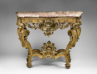
 Ready?  Get out your table saw because we've got ourselves an 18th century German Rococo gilded marble-top hand-carved table to build.  Yes?  No?  Okay fine then, at least we can enjoy this table, too bad it's slightly out of our budget by $41,000, just a little, not much.

 Hand carved table:$149, RT:$349.76
Let's go with this more pocket appreciating table.  Project #4.  Light sand to rough up surface, prime, paint flat black and let cure completely.  Paint a satin cream color and let cure completely.  Once table is completely cured lightly sand the surface to give a worn finish.  Tediously fun, same function as $41,000 table, project done!
Chinese Vase:$9.99, Paper Mache Reindeer:$4.99, RT:$364.74
 Top that table off with this Chinese blue and white vase, throw some fresh flowers in weekly to switch it up and your last and final project; spray this paper mache reindeer gold and let it dry.  Reindeer too lightweight, cut out the bottom, add some marbles from your local crafts store and seal the bottom again.

 Vintage French Round Side Chair:$199, RT:$563.74
Finally sit your bootay down, take your shoes off and relax because your projects done and you still have some money in your pocket on this ultra comfie chair from Restoration Hardware.  It doesn't have a pattern like our inspiration room because that has a vintage hand stitched fabric, but make it your own!
 Add it all up with tax and drum roll please
$618.70


Saturday, September 4, 2010

A Heroes Drapes

Overlooked and forgotten and the most common in every single room of your home; your window.  When designing a room it is the one large item that can successfully bring together the design of the room or it can fail horribly.  Brandon, a friend of mine wanted to know how to incorporate his window coverings into his room.  Well since none of you know Brandon, let me give you a little information, he is a manly man and nothing of femininity will fly with him.  So, today is all about "manly" window dressings.  And for that I will refer to one of my all time favorite movies, Hero with Jet Li.


Now how does this movie tie into "manly" window dressings you ask.  Simple, for anyone whose seen the movie it has fabric galore.  Fabric is in every significant part of the movie, draped, flowing in the wind, twisted and turned into something of such simple and understated elegance. Jet Lis character remains a nameless assassin through the entire movie.  His main purpose is to bring down the King of Qin for massacring his own people.  Along the way he meets multiple assassins who protect the King and with each conquest becoming exceedingly difficult it is done so with fabric, artistry and color.


In this scene the nameless assassin fights with Long Sky amidst a backdrop of a town square where black and yellow are the prevalent colors.      
Like the scene above these black and yellow leaf curtains create a wave pattern that eludes the eye.

This serene scene is a sorrow filled one where the death of Broken Sword by Flying Snow is represented with the flowing white fabric.

White sheer curtains are trimmed with black and a matching valence to add finishing touches to this room.


 Here a servant seeks to avenge her masters death on Flying Snow.  The scene is full of the servants anger towards Flying Snow and the calmness that comes with the servants eventual death is displayed through the golden fallen leaves. 


Much like the scene displayed above, this fluffed velvet curtain is a marriage of two warm colors that can add warmth and brightness to any room.

Extra Tip
To keep your home nice and insulated during those extra warm and cold months look into dual pane windows.  If dual pane windows are out of your budget or you live somewhere modifications to the exterior are not allowed then look into cellular shades.

Cellular shades such as these provide your home with extra insulation.  They keep the heat out during the summer months and keep the warmth in during the winter months.  A smart investment for any home. 

Remember when making any window dressing "manly" stay away from plain sheers, heavily brocade patterns and even shiny textiles.  They tend to look feminine and soft in nature.  Instead look into sheers that have a trim, adding depth, look for textiles with a matte finish and finally if you think it's too feminine it usually is.  Have a great Labor Day Weekend everyone and be safe.

~xo~Michelle~xo~