Friday, April 15, 2011

Great finds, unlikely Homes

I shook my head in agony and I tossed and turned and turned and tossed in bed and I couldn't wrap my brain around it.  A new blog, what to write, what to write?  Arrgghhh, frustrating, I thought maybe if I looked at other blogs it would help, it would get the creative juices flowing, right?  Wrong!!!  Nothing came to me, maybe in a dream it would, maybe it would, right?  No, still nothing, so how did I come up with this idea?

I was driving one day and decided to stop in a thrift store and I happened to come across this.


I thought great, very reminiscent of a Savonarola stool, with gilded leafing and leather backing and bottom.  My lord, after fourish months I have a topic.  Great finds, unlikely Homes!  These pieces could use a nice home to go to, one where they will be surrounded by other beautiful items just like them. 
From traditional and classic to modern and chic this ivory cut out settee would fit perfectly in any modern, or transitional loving persons home.  And, drum roll please.......I found it at yet another thrift store!  Much like the small Savonarola imitation this settee just needs to be loved and amongst other loved belongings. 


A little more soft and a little m ore comfy, this stream-lined arm chair is a classic timeless piece.  Kept simple and with light colors this chair would look good with just about any kind of design.  And the price is a steal, shhhh, don't tell anyone I said that word! 

Finally, I couldn't leave out something fun and flirty.  Something any girly girl will love to have.  A lamp that could make a room, a room that can be designed around a lamp, something simple and ah-dorable!  The fringe trim on this lamp is gorg., no? 


Forgotten places is where forgotten pieces have gone to live and who knows for how long? I say forget going somewhere new and see what your local thrift store, salvation army or consignment store has to offer.  They've got great finds at great deals, the fringe lamp only $11, the stream-lined chair, only $69!  Great deals, great finds, need homes.  And you know the weekend is here and you have all the time to bargain shop!  

Enjoy your weekend everyone & don't forget those thrift shops
~xo~Michelle~xo~

Wednesday, December 1, 2010

Stress-Free Design?

 Sometimes design can make you feel like this.  You want to pull your hair out, you want to cry, you and your loved ones are fighting because you are living in a mess.  Well let's get real people, design is not like you see on television.  As much as I would love to believe it is, it is NOT and the expectations that we have on ourselves are unrealistic.  What you don't see is the behind the scene stuff; the already ordered cabinetry, the crew they have working twenty-four hours non-stop, the inspections they must pass (if they are obtaining permits).   Nobody wants to see all that boring stuff, they want to see the before, and the after.


Todays post is simply about making you have real expectations for your project, how to keep your stress level down to a minimum during it.  Stress adds weight, causes you to loose weight, it takes a physical toll on your body, why make this process harder than it needs to be?


#1. Functionality:
          What room are you remodeling?  Who is this room for?  How much time does that person spend in that room?  What is the main thing that they do in that room, say 75% of their time?  Whether that's bending down to get something, cooking, or just playing, think of function before you think of design.  Function helps take you on to the next step.


#2.  Research:
            Research for everything.  I am not saying to bury yourself in books and the internet but take the scope of your project into consideration.  Moving walls, repositioning walls; some might be load-bearing, some might have headers, look for a good general contractor.  One who can do all the work is easier than having to hire someone for every little thing that needs to be done.


Too many choices, feeling trapped and lost in a maze.  Select a designer, look for a good one.  Good ones typically have good referrals, if you don't know anyone who knows anyone ask if you can see their client book and if they are just starting out ask to see their student work.

If you are doing the work yourself then you definitely need to learn the difference between flooring, paint, fabrics, etc...etc...The difference of what you pick is going to be depending on who the room is for (Ha!! refer back to #1).

#4.  Time Management:
            This is the part that needs to have realistic goals set for yourself.  I know a general contractor who can complete a project within four weeks.  Four weeks, that's from tear down to completion pending permits and all.  The reason it takes four weeks is because he already has everything ordered (refer to television), NO construction or demolition starts until everything is in place.  This will save on arguments of living in a mess, discovering you have mold in your walls,etc...etc....This helps with your time people, it does! 


DO NOT, I repeat DO NOT start a project when you know you are on a deadline!  You might think oh hey I can get this done within two days and it turns into a four week project.  Like I stated before and can not stress enough, most of us who are doing this work have jobs, 40 hour jobs, while the people on the t.v.; well that is their job so they have all the time in the world to get it done.

All I can say is plan, plan, plan....It will definitely help you out in the end.  Your face will be cleansed of the stresses of back-ordered materials, because you did not pull up your flooring yet, you waited....patiently.  I am so proud of you for waiting, and you will be too.  Enjoy the rest of your week everyone!


~xo~Michelle~xo~

Wednesday, November 17, 2010

Yes, it is upon us

The holiday season and the holiday craze.  Having parking spot standoffs in the lot of the mall, fighting crazy mad lines just to get that last perfect present.  As crazy as this season is it is by far one of my favorite times of the year.  Celebrating togetherness no matter where you are or what belief you are.  And I ABSOLUTELY love it!  Today I thought I would share something quick and small, not really focused on design, but something that has brought the people in my little-(ish) town together every year during this season.  And that would be, Deacon Dave's.


Every year Deacon Dave puts up this spectacular feast of lights and starts showing them in November.  If you are a local or know someone who is then you know where this house is every year and being the wonderful Deacon that Dave is, he is courteous enough to let anybody walk through his front yard and peer in his windows.
Waiting in line, almost there

The typical wait is about forty to forty-five minutes.  This has gotten so large over the years that police occasionally patrol and their are line-enforcers.

The trees on the outside entrance


And finally we made it inside!  Tell these little girls to get out of my snapshot!  I am trying to look at Santas Workshop, ugghhh.  I'm just playing (all the kids that come are oohing and ahhhing at this and it is amazing)  I mean I am an adult and I still ooh and ahhh at this every time I go.


Once you walk past Santas workshops you come across his window displays at the front of the home.  Here is a small town with the reflection of all the lights bouncing off of the window.

Window display of the nativity scene


As you pass the window displays you come across a bridge and to the left there are rotating ice skaters, and to your right is a waterfall display (the picture did not come out due to the lights directly in front of it).


And finally this is the scene when you leave the house.  Every year he has a light count and every year the Deacon puts up more lights than the previous year.  I think that he has a small army of people helping him because he only starts this every October!  I'm not sure and perhaps I will never know, but even if you don't celebrate Christmas this will definitely be something that your entire family can enjoy as I do.  Enjoy the rest of your week everyone!

~xo~Michelle~xo~

Wednesday, November 10, 2010

Tres-Uber Chic

Today we are going to go on a journey of design all while shopping and eating at the same time.  We are going to look at great designs, all while enjoying a nice day out.  Well, I mean if we had our own private jet that could take us from country to country.  All the while, it's nice to dream.  Our first stop, Europe.
 Okihana; Europes first anti-aging and health concept store.  Now I am a little young to be considering going in here, but why not take preventive measures right?  I mean look at it, how could you not?  Everything that the anti-aging process is, is in this store.  The branches, symbolizing how rough the aging process is, the whiteness gives the store a Dr.s room sterile kind of feeling.  I'm feeling a little cold in here so lets go to our next destination.  Jet please!
Ms. B.'s Sweets, Tokyo, Japan.  I was feeling a little hungry and saw this window.  Ms. B.s Sweets is far from your average Japanese design.  It speaks traditional, it speaks feminine, soft and beauty.  The chandelier alone speaks mountain, which was originally designed for the British Embassy in Rome in the 1950s.  Whoooaaa, all this sugar, I need something to drink, preferably something strong to keep me awake for the rest of our jet-setting. 
Milan, Marc by Marc Jacobs.....A coffee shop with a twisted wonderful play of lighting.  I mean why wouldn't the lighting be the main focus here?  Synonymous with fashion the appropriate light setting makes the fashion that much more appealing.  Marc, now you make me want to shop.


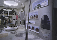
Back to Tokyo, an uber-chic Tokyo flagship store, Marni.  With plays on geometric shapes and a large combination of textures this store was thoughtfully designed to wow and keep clientele coming in. 


Still in Tokyo, The Romanticism Womens Clothing Store features a unique honeycomb structure that makes you wonder what kind of store it is.  It keeps your eye drawn upward and with minimal display makes you enter without knowing it.  This has been a really long day so now I need to lie down.
This hostel in Bangkok is sure to provide some affluent accommodations, with every room painted a different color and different design you are sure to have a conversation starter while flying solo or more. 

Every store has some sort of design to it, whether it be your favorite coffee shop, clothing store, or what not it is meant for you.  If you keep going back there then you are exactly the kind of clientele they had in mind when they designed it.  See what you like, see what your favorites are, this could tell a lot about your personality, if you take notice.  Have a great Hump Day everyone.

~xo~Michelle~xo~

Sunday, October 17, 2010

As fine as wine, as sophisticated as fashion

As ethereal as the goddess; Aphrodite, if food, wine and fashion could somehow amalgamate I would spend all of my days locked in a villa by the ocean ordering room service.  Why talk about food, wine and fashion?  They, along with the beach are three of my favorite things in the world.  Today I am focusing on fashion, merely fashion and fashionable rooms.  Homes that speak fashion, homes that might have started from something as simple as a single piece of fabric and transformed into something as creative as Haute Couture.
Ready to wear dress by Reem Acra
If Reem Acra herself would appear at my door and say this dress is my personal gift I bestow upon you I would not mind, not one bit...the same goes for this desert home in Santa Fe.  Bold, but tranquil at the same time, the two co-exist fashionably.  Set a lucite runway across this water feature and you can have your very own show....I'm just saying, you have options here.
Home in Santa Fe
Here is something that no one can say is not green, literally.  A Project Runway contestants entrance at Fashion Week in NYC.   An idea, a light bulb, something goes off in someones head and as the wheel turns, it increases its speed, faster and faster until you near the completion of your project and you end up with a room worth mentioning, a room worth mentioning over, and over, and over again. 


JASON WU& MARBLE!  I don't know how much I really need to say, I really don't.  Marble is always classic and elegant, Jason Wu, well, phenomenal.  A great designer, and natures great design.

Forward thinking has always made for the greatest innovations.  Creativity does not need to be combined with anything to become inspirational.  It all starts from somewhere and ends up creatively yours.  Have a beautifully creative week everyone!

~xo~Michelle~xo~


Sunday, October 10, 2010

Crackpot Color Theories & their meanings

Roses are red, the sky is blue, today I am exuding pure color to you.  Many people believe that certain colors evoke certain emotions.  "Studies" say that people who over a long period of time are exposed to the color red are "easily excitable", while others who are exposed to green and blue feel "serenity and calmness".  I'm here to squash that theory.  Whose to tell us how a certain color makes us feel?  Isn't that why so many of our favorite colors vary?


They say never paint a room red because you will always be excited, well not excited but angry and brooding.  How many people brood on a daily basis?  I know sometimes I do, but it has nothing to do with the colors that surround me, other things , YES, absolutely, color, definitely NOT!


I once did a school report on this designer, David Hicks.  $1000 an hour was his fee, $1000!  After his father passed his mother moved their estate (the city escapes me, somewhere in London, yes he's a Brit), David remodeled their estate, had a friend over from House and Garden who had to photograph the estate known as South Eaton Place.  The article made a name for him and the fact that he married Lady Pamela Mountbatten helped to secure his spot as a high society designer.  But enough about him, this is in fact about color.....Look at it, just look at IT!  Bold and red and exuberant and sexy.  An eclectic mix of colors and display lighting, you CAN NOT tell me that you feel anger when you see this room.  


Okay so I take it back....yellow is supposed to be the excitable, make kids hyper, it's supposed to increase their adrenaline level, make them jump off of the furniture while making adults restless.  I thought that was sugar, no?  Yellow done right, done well, done appropriately.  That is how I feel about this room.


Blue makes me think of the ocean, the waves crashing down making that whooshing sound that I love.  The ocean, for some odd reason we stare at its vast span when at the beach and that evokes emotion.  Is that why they say blue has calming properties? Is it because the beach always seems to put everyone in a better mood?  Who knows why really?  I just think plain and simple it's pretty...it's tasteful, it's done elegantly and with class.  That's my opinion, you form your own.

Yellow+Blue=Green, it's simple addition and that is what we have here.  Now in my opinion green is one of those colors that is hard to get right.  It is so easy to mess it up, too many pastels, too many apples, too dark, too light, too blah, blah, blah.  Do you feel any emotions when you see this room?  What do you pick up on?  How does it make you feel?  If this is the type of "studies" that color theorists do then of course they are going to say certain colors evoke certain emotions.  Those are the ones they are looking for, it is a biased study within itself.  I say who cares?  I say it a lot.  If you absolutely love a color, do it, no one has to like it but you, and that is exactly why it is called yours and not theirs!

A final note, do what you want to do.  Feel the way about a color you want to feel.  Design what you want to design, how you want to design, there's no apologies in design, just beautifully created mishaps.  That is how some beautiful work is created.  Enjoy your Sunday and the beginning of your week everyone!

~xo~Michelle~xo~


Friday, October 1, 2010

Cry-Bots are scary enough

     Three quarters of a year, two hundred seventy days and sometimes more!  I'm talking about BABIES!  Women carry them for that long and it's astonishing to me.  A little person inside of you, playing tug of war on your insides, just walking around, lounging and sleeping as you carry them for nine LONG months. 
     Once out this little poop factory is even more demanding.  Needing around the clock care and an endless amount of attention throughout the middle of the night you must be prepared.  This sleep depraved, child-rearing experiment could go awry if you let it, well DON'T!  So today, for Rosita, we are talking about nurseries; what to do, what not to do, and even throw in some who cares about that in there.
 

The who cares part of this is actually the design....I know shocker, right?!??  That's okay we will get back to that later, for now we are working with the bare bones of your project.  The BIG THREE.  If you want feel free to share the BIG THREE with your family and friends.  Well actually not if you want, you can't keep this information to yourself.
#1. THE CRIB

The Cinderella Carriage
 As lavish or bare bones as you want the crib to be it needs to be functional.  Imagine a crib for your Princess, because lets face it the minute that little person comes you will see them as nothing else.

With more bells and whistles than some of the cars you see this Intellicot crib is the bell of the ball.  It comes equipped with an auto lift system, air conditioning, nightlight and even has a rocking feature to rock your little person back to sleep. Talk about function, right?  Whatever crib you invest in make sure you do the bending test!  Get close to the crib to pick up your baby, you have to make sure you are the appropriate height, right?
#2. THE CHANGING TABLE
My friend with two kids told me a baby changing table is a waste of money....Then I showed her this one.  She thought I was talking about the one that you put up on the wall.  She replied,"Ooooohh, I like that one."  Why?  It's multi-functional.  A place to sit your little person, change their insurmountable amount of doody filled diapers and what do you know?  All of the items you need to do this; ointments, diapers, baby wipes; have all been strategically placed for your easy reach.
#3.  SEATING

 I can't stress enough how much sleep you will be loosing once, well you know.  Make it easy on yourself.  Can't splurge on the intellicot crib above, well rock your little person in a glider chair with an ottoman.  You might fall asleep yourself.  Now on to my favorite part, the DESIGN (sung in a melodic high-soprano tune)!!
This room is what I consider awful!!  I hate, hate, hate with a passion rooms where the parents feel it a necessity that because they welcome a new son or daughter they have to use that color that everyone always goes to; hideous pink and blue.  This room above looks like a someone blew an enormous bubble gum bubble and it burst all over this room.  Bleeeccch!  Think out of the box, be different, don't be normal.  Normals sounds like a snooze fest to me, personally.

Neutral....why can't it be considered for a baby room?  This room above is chic and pristine, it's not your typical little person room.  It has all the elements that are great for your child to grow up in and they can still love it.  Hmmm, something to consider.  No matter what design style you have there is a chic, functional baby room in all of us.  It just wants to get out, remember no timidness here.  Congratulations on your little person Rosie!  I can't wait to welcome her into the new exciting world with you!  Have a good Friday everyone!

~xo~Michelle~xo~